Making front of pack nutrition labelling work for consumers


Executive summary
It is a lot more difficult to eat healthily than it should be. Which? research [1] shows that many people are finding it even more difficult as a result of the cost of living crisis, particularly those on lower incomes. As a result, the UK has one of the worst obesity rates in Europe.
Front of pack (FOP) nutrition labelling is an important tool to support consumers make informed choices. There is evidence that FOP labelling, if used effectively, can help to support healthier choices and, as part of a range of measures, help support a reduction in obesity prevalence in the UK [2].
Our latest research has therefore looked at how the current FOP labelling scheme is working for consumers, and whether it could be improved or changed to an alternative scheme. Our findings reinforce that front of pack nutrition labelling is an important aspect of the strategy needed to support healthier choices and ultimately lead to a reduction in obesity rates and diet-related disease more generally. While labelling alone does not provide a magic solution, it plays an important role enabling informed choices and the current Multiple Traffic Light (MTL) scheme is well-liked and recognised by consumers with different levels of engagement with healthier eating and across all income levels.
We found that the MTL scheme is still preferred over the other main FOP options that have emerged, but that people thought that it needed to be improved by simplifying it and increasing its prominence. The scheme also needs to be used, and used consistently, by all manufacturers and retailers and should be mandatory. Government guidance sets out how the current national MTL scheme should be used. It has three elements: traffic light colour coding that shows whether levels of fat, saturated fat, sugar or salt are high, medium or low; the amount of these nutrients per recommended portion as well as for calorie content and how this relates to recommended daily intakes (% reference intakes or RI).
FOP nutrition labelling is already widely used on a voluntary basis at retail level in the UK, in addition to the nutrition information on the back of pack which is mandatory. Government guidance [3] sets out how the current national MTL scheme should be used. It has three elements: traffic light colour coding that shows whether levels of fat, saturated fat, sugar or salt are high, medium or low; the amount of these nutrients per recommended portion as well as for calorie content and how this relates to recommended daily intakes (% reference intakes or RI).
The MTL scheme has been in use for well over a decade and other schemes have since emerged that are widely used in other countries. Two stand out - the European Nutri-score scheme, which gives an overall rating of how healthy a food product is on a scale from A to E, and the Chilean Warning Label scheme which is included on products that have high levels of sugar, salt, saturated fat or calories.
Despite the MTL scheme being advocated by the government as the UK’s national scheme, its voluntary nature means that it isn’t used by all manufacturers or retailers. Some don’t use any FOP labelling; others use parts of it but don’t apply the traffic light colour coding, a fundamental part of the scheme. The flexibility allowed in the MTL scheme guidance also means that there can be a variation in how it is presented visually as well as how it is applied, for example, in terms of suggested portion sizes.
Which? has therefore undertaken research to better understand how the MTL scheme is working for consumers and whether it could be improved to better support healthier choices, as well as avoiding unhealthy ones. We also wanted to see how people thought the Nutri-score and Chilean Warning Label compared to the MTL scheme.
We split our research into two phases. Firstly, we used a novel app-based AI tool to help gain an ‘in the moment’ understanding of how people interacted with the MTL scheme when shopping and then when preparing food at home. We followed this with deliberative focus groups to explore in more detail how helpful people found the MTL scheme when shown on different types of products and how it compared to the other two schemes. We compared how useful people found these different schemes in making choices and also asked how people thought that they could be improved.
Overall, our first phase indicated that the current MTL scheme helped consumers make healthy and informed choices about food. For the second phase, we designed our methodology, in consultation with our Advisory Group, to address potential bias towards a scheme that people may be already familiar with. This included sampling a mix of participants who did and did not usually use the MTL scheme, a pre-task to introduce familiarity of the two other nutrition labels, and randomly assigning the order of nutrition labels for deliberation. Participants were asked to consider and discuss each label in depth before being asked, at the very end of the session, which scheme they preferred. We also explored the reasons behind people’s rankings to understand what was driving their preferences, rather than relying on instinctive familiarity responses. This phase found that the MTL was still people’s preferred scheme mainly because it offered a breakdown of individual nutrients and indicated whether the nutrients were healthy or not healthy. However several areas for improvement were also identified. This was consistent across the different groups of consumers included in our research, whether health conscious or not and regardless of level of income.
- The MTL label was seen as a quick and easy way to assess how healthy a product was, with simplicity and clarity as its main strength. People liked the MTL’s dual approach with colour coding that could be scanned in seconds supported by more detailed information for those who need it. However, people felt that it was not always as visible and clear on packaging as it could be, with greater consistency and visibility identified as areas for improvement. People also highlighted the need for awareness raising, and improving its simplicity (e.g. by removing the % RI information which can be difficult for some to understand) and making the recommended serving sizes more realistic and consistent.
- The next preferred scheme was the Chilean Warning Label. This was also appreciated for its simplicity because of its clear and direct messaging. Its ‘no nonsense’ warning-style format caught people’s attention and was seen as effective for identifying unhealthy products and helping prevent impulsive purchases. But it was felt that it lacked detail and didn’t show the levels of the nutrients. While it is good for identifying foods to avoid, it doesn’t help identify healthier options or differentiate where products may just be beneath the threshold for a warning.
- Nutri-score was also liked for its simplicity and its scoring system makes it easy to see what is both healthier and less healthy, with the colours seen as intuitive. People also liked the consistency it provided across products which was helpful for comparing and making a quick decision. But people felt that more information was needed on the specific nutrients the scheme related to.
How the three schemes compared
Multiple Traffic Light Label | Chilean Warning Label | Nutri-score Label | |
What’s working well | Familiarity Traffic light colours Detailed nutrient breakdown Adaptable for different users | Simple and easy to interpret Encourages avoidance of certain items Government endorsement enhances trust | Good for comparisons at a glance Good for those with accessibility needs and children |
What’s working less well | Information overload for less engaged shoppers (% RI) Lack of design consistency Portion sizes are different for different products | Lack of detail - doesn’t explain levels and portion sizes Not suitable for all (with more specific needs) Can be off-putting and alarming | Lack of detail confuses some people Missing information - lack of information to inform choices Lack of context around what is included |
Label preference overall | Make it consistent across products Standardised serving size Removed too much detail (% RI) | Greater transparency about criteria | Explain what the categorisation means Explain what nutrients are included |
Our research supports the need to look again at FOP nutrition labelling as part of government work on a national food strategy. Our findings suggest that a complete redesign of the scheme is not needed. People do value the MTL scheme, particularly the use of traffic light colours and nutrient breakdown, but they highlighted areas for improvement that can make it more impactful and easier to use. It is also important that it is used by all manufacturers and retailers.
The food regulatory landscape is changing and this will impact on how the government can address FOP labelling. The UK and EU are negotiating an agreement (a Sanitary and Phytosanitary (SPS) agreement) that will lead to the UK aligning its food standards with the EU in many areas in order to reduce border checks [4]. This could include food labelling, but there is the possibility for exceptions to be agreed. The EU does not currently specify a FOP labelling scheme but, as was the case when the UK was a member state, allows for voluntary national schemes [5].
This adds an extra level of complexity in designing and requiring a revised FOP nutrition labelling scheme, but should not prevent the UK governments from updating the current scheme so that it works better for UK consumers.
Recommendations
- The UK needs to adopt a consistent, effective and prominent national FOP scheme across all food products and ideally this should be mandatory.
- The UK should seek an exemption as part of the current negotiations for a Sanitary and Phytosanitary Agreement with the EU that enables it to regulate to require a consistent scheme. If this is unsuccessful, the current guidance on a national scheme should be updated and the government should monitor food business use of the scheme to ensure its comprehensive and consistent use.
- The Multiple Traffic Light scheme should continue to be the UK’s national scheme as it emerged as the preferred choice in our research - but with improvements that will make it easier for consumers to use. This includes considering whether % reference intake (RI) information is needed and how portion size information can be more realistic. More generally, the nutrients and criteria underpinning the scheme need to be reviewed and any inconsistencies with current dietary advice (e.g. in relation to free sugars) should be addressed.
- The Multiple Traffic Light scheme needs to be widely promoted and form an important aspect of a wider strategy to support healthier and more affordable choices. This also needs to be backed up with effective enforcement and oversight by the Food Standards Agency and Food Standards Scotland to ensure that its use aligns with guidance and does not mislead.
Introduction
Front of pack (FOP) nutrition labelling is a valuable tool to help consumers make informed choices about what they are eating at a glance. Its use is well-established in the UK and it is used across a broad range of food products. There is evidence that FOP labelling, if used effectively, can help to support healthier choices and, as part of a range of measures, help support a reduction in obesity prevalence in the UK [6].
Many people are struggling to eat healthily and the UK has one of the worst rates of obesity in the world. While the provision of nutrition information on the back of pack is a legal requirement, FOP labelling remains voluntary. The current UK scheme that is recommended by the government is the Multiple Traffic Light (MTL) scheme [7] but some manufacturers do not use any FOP labelling at all. Others use a FOP scheme, but present it in a black or grey format, rather than using the red, amber and green colour coding that is recommended. Even when the MTL scheme is used, there are different styles of presentation across manufacturers and retailers and it can be used selectively on different product ranges..
Alternative FOP labelling schemes have been developed in recent years and are being used in other countries - most notably the Nutri-score scheme which is used in several other European countries and the Chilean Warning Label.
Which? has therefore conducted research to understand how the current FOP nutrition labelling scheme is working for consumers and how useful people find it when it is compared with the alternative schemes that are being used and promoted.
We conducted two phases of research - firstly we used a novel app-based tool to help give an ‘in the moment’ understanding of how people interacted with the current MTL scheme when shopping, and then when preparing food at home. We followed this with deliberative focus groups to explore in more detail how helpful people found the scheme when it was shown on different types of products and how this compared to the Nutri-score and the Chilean Warning Label schemes.
Multiple Traffic Light labels, Nutri-score and Chilean Warning Labels
The four UK governments have recommended that companies use the national MTL labelling scheme on their products since 2013. Government guidance specifies how the MTL scheme should be applied and presented, while allowing some flexibility. The MTL scheme includes three main elements that help consumers assess how healthy a product is:
- red, amber and green colour coding to indicate whether the levels of key nutrients of public health significance are high, medium or low;
- the amount of these nutrients as well as energy per portion; and
- and the percentage they contribute to the daily reference intake (% RI).
The Chilean Warning Label scheme is a simpler scheme as it requires that all foods and beverages that are high in calories, sugar, sodium or saturated fat must be labelled with a warning symbol.
The Nutri-score scheme does include colour coding, but it gives an overall rating of how healthy a product is based on a score from A to E and with a five colour nutritional scale from dark green to dark orange. The scale takes into account the amount of nutrients and foods that should be encouraged (fibre, protein, fruits, vegetables, pulses); as well as the amount of nutrients that should be limited (energy, saturated fat, sugars, salt and non-nutritive sweeteners).
Studies have been conducted to compare the effectiveness of different FOP schemes. For example, a Department of Health and Social Care (DHSC) commissioned randomised controlled experiment conducted in 2020 [8] found that compared to no FOP labelling, all schemes that they assessed (Multiple Traffic Light, Nutri-score, the Chilean Warning Label and an endorsement logo) improved people’s ability to rank food and drink products for healthiness. This found that Nutri-score performed best, which is consistent with other studies, followed by the Multiple Traffic Light scheme. In this study the difference between the two was relatively small and not significant for individual foods. There were some indications that Nutri-score was most effective for those with a lower education, but this was not the case for all foods. The MTL scheme performed better in terms of people perceiving that they understood the scheme. It also found that the effectiveness of FOP labelling might differ depending on the product type and context or motivation for buying, e.g. if for pleasure.
Our research builds on this by focusing on consumer preference and needs, and the first phase was conducted in real-world settings rather than controlled lab environments.
Why we need to look at FOP labelling now
As well as the emergence and take-up of other FOP labelling schemes, it is a key time to be reviewing the use of FOP labelling for other related reasons.
- A public health imperative
It is much more difficult to eat healthily than it should be - and so it is important to consider what role FOP labelling can help in addressing this. A Which? survey in 2024 [9] found that over half of people were finding it harder to eat healthily compared to two years earlier and people on lower incomes were struggling the most. The UK’s National Diet and Nutrition Survey data shows that many people’s diets do not align with what the government recommends [10].
As a consequence, around two thirds of the population are currently overweight or obese and obesity-related ill health is estimated to cost the NHS over £11.4 billion every year with wider societal costs estimated at £74.2 billion annually due to ill health [11].
The latest findings from the National Child Measurement Programme (NCMP) show that 10.5% of children in reception and 22.2% of year 6 children are living with obesity. Obesity prevalence is more than double in the most deprived areas compared to the least deprived (14% compared to 6.9% in reception and 29.3% versus 13.5% in year six) [12]. Death and disability from dietary risks such as eating too little fruit, vegetables and fibre, and too much food high in fat, sugar and salt has risen by 46% in the last decade [13].
- There is evidence that FOP labelling has a role in tackling this
Addressing this is complex and a broad range of actions will be needed to support a shift to healthier diets - or as the UK government described it in its recent national food strategy framework, shifting from a ‘bad food cycle’ to a good food cycle’. Effective FOP labelling is one measure that can make a difference.
When we surveyed last year about the support people wanted to make it easier to eat healthily, the provision of clear nutrition labelling on the front of all food packaging was one of the most popular actions that they wanted from supermarkets as well as from the government [14].
There is also evidence that an effective, consistent scheme will help to make a difference to obesity rates. Work by NESTA [15] on a blueprint to halve obesity in the UK has assessed the relative costs and benefits of obesity policies. It made eight recommendations, one of which was enforcing provision of ‘front of pack’ nutrition labelling on packaged food in retail. NESTA recommended this as part of “the most politically palatable and economically viable route to halving obesity within a single term of government”. They estimate that enforcing the provision of interpretive front of pack labelling on retailer packaging would reduce obesity prevalence by 3%. It puts the cost to government of this policy over 5 years at £18 million while the estimated benefits are £2 billion per year [16].
The World Health Organisation has also emphasised the importance of FOP labelling as a policy tool to help consumers make healthier food choices and has set out a number of guiding principles [17]. These include alignment with national public health priorities and having a single scheme.
- The current UK MTL scheme is not used consistently
It could be argued that if the current FOP labelling scheme was the right one, people would be better supported in making healthier choices. But our research over the years, supported by a snapshot check of current practices, using labelling on different brands of pizza as an example, shows that the current FOP labelling scheme is not always used, used consistently or displayed prominently. As we describe in our research findings, this is also the experience of the participants in our latest research.
The voluntary nature of the MTL scheme means that not all retailers and manufacturers have chosen to use it - or to use it on all of their products. The flexibility for different presentations has also resulted in the scheme being presented in a range of styles and level of prominence on packaging - sometimes this is without the red, amber and green traffic light colour coding. Although there is therefore a national scheme, it can take several different forms or not be used at all.
Examples of how the scheme is used differently
- Several manufacturers do not provide any FOP labelling at all (e.g. Crosta Mollicia, Pizza Express and Italpizza la Numero Uno frozen pizzas). This can be the case both on pack and online.
- While retailers do generally provide the MTL scheme on the front of pack of their own-brand products, this is not the case for Iceland.
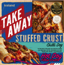
- Some manufacturers and retailers provide FOP labelling, but without using the traffic light colour coding (eg. Dr Oetker pizzas such as its Suprema pizza show a black FOP labelling scheme on black packaging so as a result it does not stand out, Chicago Town pizzas, such as the ‘Takeaway Stuffed Crust’ also include just a black and white FOP scheme.
- Presentation varies across supermarkets, as well as manufacturers, including how prominent the colour coding is displayed (see Figure 1).
Figure 1: FOP pizza packaging from supermarkets
Crosta pizza with no nutrition label (top left); Iceland Takeaway pizza with no nutrition label (top right); Suprema pizza with black and white nutrition label (bottom left); Chicago Town pizza with black and white nutrition label (bottom right)
 |  |
 |  |
- There is now a policy opportunity to improve labelling
Another reason why it is timely to review FOP labelling is because there is a policy opportunity now to take action to make sure it works as well as it can do for consumers. It is also important that the UK government ensures that negotiations with the EU on alignment of food standards to facilitate trade do not undermine the UK’s ability to regulate FOP labelling.
The UK government recently published an NHS 10 Year Plan for England [18] that emphasised the importance of prevention and making the healthier choice the easy choice. This is consistent with the national food strategy for England, as well as similar initiatives in the other UK nations. The Scottish Government is in the process of producing a Good Food Nation National Plan [19] and food and obesity strategies have been launched in Wales [20] and Northern Ireland [21].
A range of measures have been announced by the UK government, such as reporting on healthy food sales by food businesses, setting mandatory health targets for retailers for how much food they sell [22] and strengthening controls over food marketing. Improving nutrition labelling to enable informed choices about the relative healthiness of food products is consistent with the approach set out, but it is not currently part of the plan.
The current MTL scheme was developed when the UK was still part of the EU and so it was designed to be consistent with the voluntary national schemes that were allowed for in the EU’s Food Information to Consumers Regulations [23]. The UK is currently negotiating an agreement on food trade (a Sanitary and Phytosanitary (SPS) Agreement) with the EU and as part of doing this, the government has said that it intends to align UK food law with EU law to avoid barriers to trade.
There is a possibility for exceptions from alignment to be agreed as part of the negotiations. The outcome of these discussions will therefore shape the extent to which the UK has the possibility to mandate a UK FOP labelling scheme, or work within the framework for voluntary schemes that currently exists unless the EU decides to change the relevant legislation.
Methodology
We set out to understand how people actually use FOP nutrition labels when they’re choosing food, rather than in a lab setting. To do this, we used a two-stage mixed-methods approach. The first phase involved observing shoppers in supermarkets and at-home, allowing us to see the quick instinctive ways they noticed - or overlooked - nutrition information during their usual routines (i.e. System 1 thinking - spontaneous and intuitive). The second phase brought people together in guided discussions, where they could take more time to consider, compare and talk through different labelling approaches (i.e. System 2 thinking - reflective and analytical). Taken together, these phases gave us a clearer picture of both the immediate reactions and the more thoughtful judgements that shape how labels are understood and used.
Figure 2: Table summary of research design
| Phase | Focus | Sample | Setting | Purpose |
| 1 | Real-word observation | 52 supermarket 460 in-home | Natural shopping and household setting | Understand spontaneous use and trust of current labels (System 1) |
| 2 | Deliberative focus groups | 31 | Controlled discussion environment | Explore deeper understanding and preference between labelling schemes(System 2) |
Expert Advisory Group
An expert Advisory Group helped shape the purpose, scope, and methodology of the research, ensuring it remained robust, impartial, and relevant to policy. The group brought together specialists in social research, public health, nutrition, industry and regulatory practice and government. Their input helped sharpen our focus on consumer preference and ensured the research included product categories with both high policy relevance and real-world impact, where clearer labelling could meaningfully support healthier consumer decisions. Membership of the advisory group is included in the Annex. The group informed our approach and methodology, but did not sign off on the analysis of the findings within this report and the recommendations
The key decision areas that were enhanced as a result of the advisory group were:
- What labelling schemes and food categories to focus on
The group steered the project towards examining three main schemes: Multiple Traffic Light label, Nutri-score, and Chilean Warning Label. This broadened the scope beyond the MTL scheme. The group also helped refine the five product categories that were used to enable comparisons, balancing everyday staples such as breakfast cereals and dairy with items where people often need more help judging healthiness, which included snacks, condiments, and ready meals.
- How “effectiveness” should be defined
The group guided the research design to tighten the definition of effectiveness, focusing specifically on whether labels help people make healthier food choices and centring it firmly on consumer preferences and declared understanding.
- Whether to include a priming task
Based on evidence that prior exposure affects comprehension, they helped shape the decision to add a primary task in Phase 2 to improve familiarity with the schemes.
- Approaches to comparing schemes
They influenced the choice to test schemes both in isolation and like-for-like, including showing schemes in different orders, exploring how traffic elements could be refined, and testing different portion sizes.
- Sample design considerations
Advisory Group members highlighted the need for larger focus group sample sizes and sufficient representation of vulnerable groups (i.e. lower-income households and health requirements).
Phase 1 - How people currently use front of pack nutrition labels
The objective of the first phase of our research was to capture spontaneous use of the current Multiple Traffic Light (MTL) scheme in natural environments, such as in supermarkets or at home.
This phase used an Artificial Intelligence (AI) assisted app-based tool on participants’ mobile phones (see annex for more technical detail). The tool was used across two complementary tasks observing 512 participants in total: in supermarkets; and at home, and captured in-the-moment interactions between people and the current MTL scheme. This approach studied authentic System 1 (intuitive) decisions, and provided data on what consumers actually do in their environment, rather than just what they say they do in a survey with pre-determined answer options.
Task 1 - Making choices in the supermarket (n=52)
Participants narrated food purchase decisions in their usual grocery store on the mobile app. We were able to see how, and when, the MTL scheme was spontaneously used and influenced in-the-moment decisions. Of the 52 participants, 58% reported following a set shopping routine, while 42% shopped without a fixed plan.
Task 2 - Using FOP information in the home task (n=460)
Participants reviewed purchased products in their home environment, looking through their cupboards and fridges, reflecting on habitual use.
Figure 3: Illustrating AI probing examples - giving us a deeper reflection
Participant comment | AI-assisted app prompt | Participant explanation |
“I noticed this packet of biscuits has a red colour for sugar” | “You mentioned the red colour. How did that affect your decision?” | “I try to avoid high-sugar snacks, so I decided not to buy this one” |
“This cereal is low in fat” | “What does ‘low in fat’ mean for you when choosing products” | “I’m watching my fat intake, so I go for the lower-fat version” |
“I picked this yoghurt because it’s mostly green lights” | “What makes the green lights important for your choice?” | “Green lights signal it’s healthier and it saves me time checking each nutrient” |
Phase 2: How different FOP labelling options compared
The second phase explored how people understand, interpret, and value three FOP nutrition labelling options when given time to reflect and compare them across different food products.
We conducted four 90 minute focus groups with a total of 31 participants. Participants were segmented based on how health-conscious they were, and whether they had any specific needs (see Figure 3). In the vulnerability group, the majority of participants were from low income households and possessed one or more other vulnerable characteristics such as a Long Term Health Condition (LTHC) or disability (mental or physical), English as a second language (EAL), or lower levels of literacy and numeracy.
Figure 4 - Deliberative focus group participant segmentations

We tested participants’ discretionary choices across five high-relevance food categories (snacks, breakfast cereals, dairy, condiments, ready meals). The three FOP nutrition labels used on the stimulus were: the Multiple Traffic Light (MTL), the Nutri-score, and the Chilean Warning Label (CWL).
Figure 5: Example of the tested stimulus with the nutrition labels

To reduce familiarity bias with the widely recognised MTL, participants first completed a short pre-task online. Each participant viewed a product with one of the three scheme labels and answered questions about the information they noticed. This included the product’s perceived healthiness, the label’s usefulness in purchasing decisions, and its clarity (on a 1 to 10 scale). They also indicated how likely they would be to buy the product.
In the focus groups, participants were shown images of all five food categories (snacks, breakfast cereals, dairy, condiments, ready meals), each displaying one of the three nutrition labelling schemes on the FOP. They were asked to consider the products as they would in a typical shopping scenario. The order of the scheme label and category presentation was randomised across groups. Discussions were structured to compare labels and explore perceptions across categories. Through guided discussion and comparative exercises, participants reflected on:
- Ease of understanding and perceived usefulness;
- Trust and credibility of the information;
- Preferences and emotional responses;
- How each scheme supports, or hinders, clear, informed choice for healthy food.
Chapter 1: Status quo - How consumers respond to MTL labels
Key findings for using the MTL scheme in supermarkets and at home
The MTL scheme cuts through packaging clutter, helping shoppers make quicker, informed decisions and supporting healthier choices both in-store and at home.
- Good in-store visibility: 33% of shoppers spontaneously noticed the label first, ranking behind brand (40%) and price (37%).
- Supports on-the-spot decisions: Particularly useful for the 42% of shoppers without a fixed plan.
- Used for comparison: Shoppers actively referred to sugar (56%), fat (48%) and traffic light colours (21%) when choosing products.
- Influences decisions at home: 71% said MTL scheme affected their purchases; 54% used it to select healthier options in their cupboards and fridges.
- Colour coding drives quick choices: Green indicators highlighted healthier options and the absence of red reassured shoppers.
- Nutrient breakdown supports targeted decisions: Sugar and fat are the most influential nutrients, guiding both everyday and dietary-specific choices.
Do consumers notice the MTL label?
When people go to the supermarket, they usually have one of two mindsets: either they already know what they want to buy, or they just know they need food but haven’t decided what. We found that 58% of the 52 participants in the supermarket task had a fixed plan and 42% didn’t know what they were going to buy. It is in these less structured moments where the MTL scheme plays a useful role and helps people sense-check choices when they are not relying on routine alone.
Our findings showed that the MTL label can be very salient in these key purchase moments. In the supermarket task, when shoppers purchased items, such as snacks, dairy and cereals, 33% of them spontaneously mentioned the nutrition label as the first thing they noticed on the front of the pack. This ranked third after considering brand (40%) and price (37%). It suggests that the MTL label was highly visible for shoppers, even among other competing FOP information. It also suggests that the label has strong potential to influence decisions in real time, particularly when shoppers are deciding quickly or comparing options.
More importantly, the scheme featured strongly in how shoppers deliberated between food products. There was frequent mention of specific nutrient breakdowns, with over half (56%) of supermarket participants using low sugar to guide decisions and 48% using low fat content.
“I chose the [breakfast cereal] because they have healthier nutritional information, being lower in fat and salt.” - supermarket task participant
There was also explicit use of the term ‘traffic light labels’ by a fifth (21%) of the shoppers. It shows that, when visible, the MTL label naturally integrates into real-time judgements. We noticed this was particularly true for family purchases:
“When choosing yoghurts or cereal for my kids, I immediately look at the traffic lights to see which one is better for them” - supermarket task participant
The visibility of the MTL label extended into at-home behaviour too. Across those completing the at-home task, seven in ten (71%) said FOP labels influenced their buying decisions, and more than half (54%) found them especially helpful for choosing healthier options already in their cupboards or fridges.
How do consumers use MTL labels when shopping?
We found that in real-life scenarios, shoppers do use the MTL label on-the-go to make decisions about what is healthy and what is not healthy to buy. A quarter (25%) of at-home task participants spontaneously mentioned that the MTL scheme fostered healthy eating awareness when they were shopping.
“I like the traffic light scheme because it is simple to use, promotes healthy eating, avoids complicated statistics or confusing wording, and clearly shows how it will affect my body.” - at-home task participant
“I like that it’s easy to understand at a glance, and doesn’t require extra time to check elsewhere.” - at-home task participant
We found that the MTL label helps consumers both identify healthier options and avoid less healthy ones. Participants used the labels in two main ways: colour coding provides a quick visual guide and the nutrient breakdown supports more deliberate comparisons between products.
Colour coding
We found from both the in-supermarket and at-home tasks that the scheme’s colour coding contributed to this visual clarity and simplicity. Nearly four in ten (39%) at-home participants found the scheme visually clear and 28% said its simplicity made it easy to use when time-pressed. It guided some consumer choices through a combination of positive signalling - with the green indicators - and avoidance cues - with the red indicators.
Among the supermarket task participants, green indicators were the most frequently noted feature when shoppers were asked to pick a healthier alternative to the one they originally picked. Participants described how the prominence of green cues made healthier options stand out:
“The three green colour codings were prominently displayed at the top” - supermarket participant
“The colour scheme of the traffic light scheme, particularly the green indicators, made it easy to identify the positive aspects of the product” - supermarket task participant
We found that the absence of red indicators also provided reassurance. One in five at-home task participants (20%) used the label to avoid unhealthy products entirely, and supermarket participants often felt that “no red” was as influential as seeing green:
“The traffic light scheme influenced my purchase decision because nothing was marked red, which reassured me that it wasn't bad for me even as a treat, and its visual nature made it easier to compare choices.” - at-home task participant
“The absence of red [...] indicated there is nothing very high in content that should be avoided [...] this was more impactful than the green” - supermarket task participant
Breakdown of nutrients
Beyond colour, many participants deliberately scanned for specific nutrients. In the at-home task, 45% focused on particular nutrients when judging healthiness. Sugar was the dominant focus for the supermarket task participants, with over half (56%) of the shoppers actively avoiding products flagged with high sugar, particularly when highlighted in red:
“The sugar content indicated by the traffic light scheme, especially when marked red, strongly influences my decision to avoid purchasing a product” - supermarket task participant
For some groups with specific dietary needs, these cues became crucial:
“As a diabetic who needs to maintain a low-sugar diet, I appreciate the traffic light scheme for warning me about products high in sugar” - supermarket task participant
Fat content - especially saturated fat - was the next most commonly used comparator of nutrients, with 48% of supermarket task participants referring to fat levels when selecting healthier options. These cues were either talked about in isolation or alongside sugar and salt:
“I focused on the fat, sugar, and salt content, prioritising lower fat levels, especially saturated fat, which was green.” - supermarket task participant
Which attributes make the MTL labels useful?
In the second half of this chapter, we focus on findings from the MTL label discussions from the Phase 2 deliberative focus groups. This covers participants' reflections about what they found beneficial about the MTL label as well as its weaknesses. We spoke to participants reflective of the UK population who were from three groups: those that were health conscious, those that were less health conscious, and those with vulnerabilities such as low income (usually in conjunction with a health condition or dietary need). The discussions progressed from group-level reflections to individual evaluations, and finally to cross-comparisons across schemes (i.e. Nutri-score and Chilean Warning Label). The latter features in Chapter 3.
Figure 6: Summary of what rated well for the MTL label

Breaks down the nutrients
Participants saw a core strength of the MTL label in the way it breaks down nutrients for each product. Instead of giving a single overall score, it uses colours and clear numbers to show levels of fat, sugar, salt etc. Many described it as offering “the fullest picture of nutritional content”, saying it was “clear at a glance” while still providing “information when you need to look deeper”. This dual design and mix of quick cues and detailed data offers versatility and allows consumers to either take a quick glance, or to explore specific nutrients in more detail, should they need.
Participants also found the approach intuitive:
"It says it clearly with the percentages and the fats. [...] So instantly when you look at it, you just instinctively know it's not complicated." - less health-conscious participant
"You can see how much fat, how much sugar, how much salt. You can see everything" - vulnerable participant
This flexibility was especially valued by vulnerable participants on lower incomes. They explained that the detailed breakdown helped them, and others in similar situations, make genuinely personal choices by focusing on the nutrients they needed to monitor or avoid:
“It gave you how much per 100 grams, actual weight… and the percentage. I could understand other people might not be into it, but to me, that made it easier to judge… I have to watch out because I have high blood pressure. So certain things I don't want to be taking. And my wife suffers from MS, so there's a lot of things that she has to avoid. So this is quite good for everyone.” - vulnerable participant
"Nutrients [broken down] is great for me, I have high blood pressure, I need to know how much salt is in it" - vulnerable participant
The less health-conscious participants echoed this point. They felt the breakdown helped them pick out the nutrients that mattered the most to them personally:
"I look at the sugar and salt. Usually that's what I look at in shops." - less health-conscious participant
Ultimately, the detailed nutrient breakdown was a key reason why the MTL label emerged as the preferred labelling scheme. Participants said it gave them clarity, useful context and greater confidence to make healthier choices:
"It’s trying to teach us to be as healthy as it can in all different areas for your nutrition" - vulnerable participant
“It gives the extra context and you can make your own educated decision with all the details of the ingredients" - health-conscious participant
It indicates both high and low contents
Participants highlighted a major strength of the MTL label is the way it provides balanced, easy-to-read cues for both high (red) and low (green) nutrient levels. Rather than focusing only on the negatives, the colour scheme gives a full picture, helping people make quick, informed trade-offs. Many said this made it easier to spot healthier options and feel more confident in their choices:
"You look at all the different traffic lights and all the different products to find the best one that fits you and that's the healthiest. And (for me) the one with the less sugars and the less saturates" - health-conscious participant
“The traffic lights let you judge for yourself whether it’s high or low or medium” - vulnerable participant
Participants felt that seeing low, medium and high levels across nutrients gave them more control and context than a single overall score:
"I'm a very simple girl. I don't like things overcomplicated. So I would just see, oh, two reds and a yellow. Maybe not, and put it down. If I'm trying to be healthy, I'd more look for, like, the greens and yellows then." - less health-conscious participant
Red indicators play an important role in helping people avoid less healthy choices, with several describing them as a clear warning:
"It's high in the fats and the salts and that is red, would just keep me to stay away from this product" - health-conscious participant
Green indicators were equally influential, acting as a quick signal that a product might be a healthier option:
“The average person would just look at it and think, oh, that's green, I'll buy that." - less health-conscious participant
"My mum is suffering with high cholesterol [...], she's having to look at low saturates, so she's looking primarily for green and something really low. - less health-conscious participant
Participants also valued the accessibility of the colour scheme. They described it as “very accessible” and inclusive, saying it worked well for a wide range of shoppers from different income levels, nutritional literacy or language proficiency:
"It is simple to use, promotes healthy eating, avoids complicated statistics or confusing wording, and clearly shows how it will affect my body.” - less health-conscious participant
"It's easy to understand for maybe people who English is not a first language or maybe people who are not that accessible reading the ingredients, they can automatically tell and make an informed choice" - health-conscious participant
"It's been put through (I don't know what you call it) the diversity or equality branch, which is a good thing because at a glance - it’s banging.” - health-conscious participant
Finally participants noted that the colour cues felt familiar because red, amber and green are widely used beyond food labelling. This everyday recognition meant the scheme needed little explanation:
"I think people are pretty used to the traffic light scheme for other things as well. So I think it's quite clear to most people what, like, red would be bad and green would be good. So yeah, I think it's pretty easy to understand." - vulnerable participant
It’s familiar and therefore trusted
Across the groups, the MTL was consistently described as familiar, normal and reliable. It was something people had used for years and understood instinctively.
Because the MTL has been in the UK for a long time, participants recognised it straight away. For them, this familiarity made it feel honest, practical and easy to trust, and they could understand it without needing to think about it:
“The traffic light scheme is my favourite because I feel like it’s all we’ve known in the UK. Probably since I was born, the traffic light scheme has been implemented.” - health-conscious participant
“People are used to the traffic light scheme” - vulnerable participant
This sense of familiarity means many shoppers rely on the MTL routinely. Participants described using it as a natural part of their shopping process, returning to it because they trusted it to guide their choices:
“Yeah, I use the traffic light label a lot. When I’m looking at a product, I always look at the traffic light label.” - health-conscious participant
Importantly, participants felt that the MTL maintains this sense of familiarity while still providing the detail they need and the nutritional breakdown that helped personalise their choices. Unlike other schemes, it offers both recognition and depth, enabling informed choices without adding complexity:
"They're familiar but it gives you more information and data to make an informed decision where the other two not less so" - health-conscious participant
Weaknesses of the current scheme
The MTL label is generally seen as clear and helpful, but the groups highlighted some important weaknesses. Too much complex information, unrealistic serving sizes, and inconsistent labelling can make it hard for people to use the scheme properly and therefore reduces how useful it is.
Figure 7: Summary of MTL label weaknesses

Reference Intake (% RI) confusion
Consumers often find nutrition labels overwhelming. For some participants the amount of detailed numerical information alongside the traffic light colours, especially RI percentages, was too much. The volume of information can lead to cognitive overload, prompting many to rely on simple shortcuts, like the colour coding, rather than engaging with the full data:
"Who's got time to sit down and work out the percentages and.everything else and so on?” - less health-conscious participant
In some cases the RI percentages caused particular confusion. Some participants misunderstood the RI percentages on labels and instead of recognising that the percentages show how much of the recommended daily intake a portion provides, they interpreted the numbers as a portion of the product itself:
“The other thing I’ve sort of questioned was the percentages, for example the 22%. I wonder, where does that come from? Is that just like a proportion of the whole box? How does that work?” - health-conscious participant
Others noted that the percentages seemed very low and wondered what made up the rest of the product, admitting they would not work it out:
"Those percentages, they’re quite low, aren’t they? So what’s in the rest? Oh, I’m not about to do the maths” - health-conscious participant
As a result, some participants said they selectively ignore the percentages and focus only on key nutrients like sugar or salt:
“It’s a bit heavy going, but as soon as I see something like this, all I look at is the sugar and salt and I’ll buy the one that’s got less sugar and less salt. So that information is good for me” - health-conscious participant
Serving sizes (portion sizes) and inconsistency
A common concern across all participant groups, including low-income, was that the suggested serving sizes often do not match how much people actually eat. Many noted they might consume two or three times the portion listed, meaning the calorie and nutrient information, including RI percentages, can be misleading:
"I've always really disliked the per grams…the servings are under half of the proposed portion that I usually have anyway. It's not a realistic portion. They need to make it a bit more realistic, like a big bowl of cereal." - health-conscious participant
Labels are also inconsistent in how serving sizes are presented. Participants noticed some referred to the whole pack (like yoghurt or ready meals), and some to a suggested portion (e.g. like cereals), while others per 100g. This makes it hard to compare products and forces shoppers to do the mental calculations to determine their true intake, defeating the purpose of a quick-read label:
“It could be serving the size of the packet, could be the whole meal. It could be per 100 grams or whatever” - less health-conscious participant
Participants felt this inconsistency could be exploited by manufacturers to make products look healthier, and ultimately undermined trust for some:
“The company that's selling the product will actually shape it the best way they can to make it as attractive as possible" - less health-conscious participant
There was strong support for mandatory standardisation, so that all products use the same units and portion references. This would improve transparency and allow people to use the labels more effectively:
"There's no standardization. You can have the pack as a serving, in this case, it’s the whole thing". - less health-conscious participant
"It just needs to be the same for all of the UK, as we mentioned about the serving for the whole packet and not just a little bit of. If you just had this much, I want to know how much it is for the whole packet. How much fat sugars for the whole packet. That would be better." - vulnerable participant
Without standardisation, and a uniform approach, the MTL label is less useful, as consumers cannot be sure they are comparing products on a level playing field.
Chapter 2: Exploring alternatives
Alternative schemes had some merits but raised concerns
While the MTL scheme emerged as the preferred labelling format across audience groups, deliberations also addressed two prominent alternative schemes: the Chilean Warming Label (CWL) and Nutri-score (NS). Both alternative schemes were acknowledged for simplifying decision-making at a glance, appealing particularly to shoppers under time pressure or those with specific accessibility needs. However, both formats received significant negative feedback, primarily due to their more limited nutrition information.
Chilean Warning Label - what works well
Figure 8: Summary what works well for CWL

It has simple and clear messaging
Participants consistently liked that the CWL has clear, direct messaging and is easy to interpret. The design is self-explanatory, relying on concise text within an octagon to state exactly which nutrients are high (e.g. "HIGH IN SATURATED FATS"). This format is considered helpful for simplifying the decision-making process by immediately identifying specific high-risk components.The clarity lies in its focus on essential facts:
"It's not giving you like a grading scheme, referring you back, it's highlighting the highest or the unhealthiest parts of it. So it's nice and quick." - health-conscious participant
"It’s telling you the two key areas. So salt, and calories. So depending if you're on a diet or you've got a focus, you would avoid it or you would lean towards it... And it's quite easy. You're not looking at percentages, numbers, colours. It's just really just defined." - vulnerable participant
The label aims to quickly convey the most critical negative information:
"it's really just aiming to give you the worst issues with the product." - vulnerable participant
It’s quite serious and feels like a health warning
Participants described the CWL as carrying the weight of a health warning. Many compared it directly to cigarette labels, noting that the stark black-and-white format and authoritative tone signal a genuine risk if products are consumed in excess. This immediate sense of gravity makes people stop and pay attention:
“This is like a cigarette warning. It's like, it's quite daunting, it's quite scary." - less health-conscious participant
The look and feel were seen as deliberate and purposeful, prompting people to take the information seriously, creating an immediate sense of gravity:
"It feels serious… like the black and white. It feels like you should be paying attention to this” - vulnerable participant
This seriousness is central to its deterrent effect. Participants felt the design makes the risks of high sugar, fat, or salt impossible to ignore, and helps people quickly recognise products they may want to avoid:
"It looks like something you put on a cigarette warning, but it instantly makes you notice, you know that the dangers of sugar, fat. So I think that's really useful. People just look at that, think okay, I won't get that. I put that back and get something healthy." - less health conscious participant
Because the label is so prominent and direct, many believed it would curb impulsive purchasing, especially for those trying to cut back or manage their weight. The warning-style presentation acts as a clear disruptor to automatic habits:
"If I saw this in a supermarket… I'd avoid it because that's what we're trying to do is reduce sugar and salt and calories. And it's in high, high, high. So you'd be like, okay, body swerve." - health-conscious participant
The visual impact was described as instant and difficult to overlook:
"It's one of the first things I noticed when I look at it... the colour scheme that they're using and the shapes… the black and white kind of draws your eyes." - vulnerable participant
It’s authority backed and that can enhance trust
Some participants found the inclusion of the official government attribution reassuring. Seeing who the information comes from helped it look official and gave the warning more weight. This stood out compared with the other two labels (MTL and Nutri-score), where it wasn’t always clear who was making the judgement about a product’s healthiness. Knowing the source of the information was an important part of building trust for many participants:
"I quite like the fact it says the Ministry of Health on it as well because it's not the brand or the supermarket that's putting it on. You know, it's coming from the health ministry. So it's not going to be too biased." - health-conscious participant
For some, they say the government ‘stamp’ implied that the information had been checked and is based on evidence, which makes the warning feel more credible and harder to dismiss:
"It looks like it's been scientists that you can link back to or trust. Give the official stamp." - vulnerable participant
"And I think somebody potentially […] said earlier that the kind of Ministry of Health thing was good. It kind of made it seem official." - vulnerable participant
Weaknesses of the Chilean Warning Label
Figure 9: Summary of CWL weaknesses

The appearance is scary and off-putting
A major drawback is that the CWL is thought to go too far with the 'warning' element, leading many participants to describe it as "terrifying," "scary," and "off-putting”. Compared to the familiar traffic light colours in the MTL and Nutri-score, the stark black and white format carries heavy negative connotations and impacts the FOP aesthetic.
"I don't think it looks really nice on the packaging? Like, if I saw that on a packaging, like just these little black blobs on the packaging." - health-conscious participant
A number of participants felt the design was overly aggressive and could create unnecessary anxiety:
"It looks like something you put on a cigarette warning [...] I think there's a lot of scare mongering to be honest." - less health-conscious participant
"It's quite dangerous territory to frighten people." - health-conscious participant
There was also concern from a few participants that the prominent inclusion of it being a government declaration felt authoritarian, which some people might resent. We had, however, presented the scheme in line with its appearance on products in Chile and so it would not necessarily have to be consistent.
"It's gonna scare people a bit when they buy something, oh, high in sugars, high in calorie. And Minister of Health. Is that really needed on the packaging? Ministry of Health. I find it a bit peculiar." - health-conscious participant
The intensely negative "warning" scheme was deemed by some participants as potentially triggering for people with anxieties around food, such as those with eating disorders. The focus on high calories was singled out as a specific concern:
"When I looked at this, I was thinking it can be potentially triggering for someone with an eating disorder, especially the high in calories part... It might not even make them pick up the product if they see that sign." - health-conscious participant
There is a lack of detail and context
While the CWL was praised for its clarity, many participants felt it didn’t give enough information to help them understand why a product carries a warning. People questioned the threshold behind the label - how high do the levels of each nutrient need to be to warrant a warning label? - and wanted to know how much of a high-risk nutrient was actually present, rather than just being told it was “high”:
"This is just a big black blob on the packaging, just telling me it’s high in sugar, but not what sugars are in there and not how much sugars are in there" - health-conscious participant
This singular focus on high content means the label works well at flagging foods to avoid, but provides no help in identifying healthier choices. Some participants, particularly vulnerable, low-income and less health-conscious shoppers, assumed that the absence of a warning often signals that a product is automatically safe and healthy to consume, particularly when authority is invoked:
"If the Government scored this as healthy [a food product without CWL], that would make my shopping that much easier" - vulnerable participant
This can lead to the mistaken belief that products without a warning are nutritionally better, when in reality they may simply fall just below the warning threshold.
The absence of nutrient details can limit practical guidance for consumers. Because the label only highlights the negatives, participants said it offers little counter-balancing information about positive or neutral aspects. Unlike the MTL, it gives no sense of what nutrients a product might be low in, or whether any nutrient levels are acceptable:
"The other two schemes tell you when something's low or medium in a neutral with the green or the orange. This just tells you when it's high. Is that okay? Is that not okay?" - less health-conscious participant
“Some sort of indication that this food is high in fat as well as it's actually low in sugar and protein.” - less health-conscious participant
Finally, some participants also wanted more context around portion sizes and how the warning fits into everyday consumption:
"It's just irresponsible really, because it's like, it just feels like the bare minimum." - health-conscious participant

The colours and letters are simple and easy to understand
The group felt that a key strength of the Nutri-score label is its simplicity. By presenting just two pieces of information - a colour (from green to red) and a corresponding letter (from A to E) - it makes it immediately clear whether a food is scoring healthily, such as 'good' (A/B) or 'bad' (D/E) overall. This concise format works especially well for shoppers who are short on time or lack nutritional literacy.
"It's to the point. I mean, it's just the colors. A, B, C, D, E. I mean, people ain't got time to look at labels and read labels. Because some people just haven't got the time and they don't want to read it." - health-conscious participant
Participants immediately recognised and appreciated this straightforward approach, noting that the familiar traffic light spectrum, makes the meaning intuitive:
"I liked it. It's obvious from A to E. A, it's obviously green. We all know what green means... The further scale is red, red's danger. So it's very easy understanding them." - health-conscious participant
This simplicity also makes it ideal for rapid, at-a-glance assessment and product comparisons. Because each product receives a single overall score, participants noted that they can quickly see which item is healthier, which is an advantage when shopping with children or when time is limited:
"But as an overall scoring it's quite easy to use. For a child or someone doesn't have the time to look at it and, and make a quick judgment. Oh, that's A, that's, that's good rather than E. That's terrible. So it's quite easy to understand." - health-conscious participant
Even participants less focused on health appreciated its clarity:
"I like this because I think it's simple. It's kind of childish, but it's simple." - less health-conscious participant
Overall, Nutri-score’s combination of colour and letter allows consumers to make quick, confident choices without needing to interpret complex nutritional information.
Overall calculation is consistent across packaging
Participants found the consistent formatting of the Nutri-score highly appealing. The label looks exactly the same across all products, always displaying the five-level scale with a single highlighted score. This uniformity makes it especially helpful for judgements and product comparisons.
The consistent design reduces cognitive load, allowing the eye to locate and interpret the score immediately. Many participants highlighted that the visual consistency and the single overall score were key to making fast, confident decisions:
“Looks exactly the same on different products” - less health-conscious participant
“Very easy to interpret due to there only being two things to look at across products – the colour and the letter” - less health-conscious participant
The simplicity makes it accessible, including for parents
Participants widely acknowledged that the Nutri-score is easy to use for people with accessibility needs, including those with poor eyesight, learning difficulties, or children. It’s clear, simple formatting (especially the large colours and letters) makes it easier to read than dense numerical tables:
"It's easier to understand maybe for elderly people as well and for the children to have this distinguishment" - health-conscious participant
Participants felt that for parents, the simplicity also serves as a practical teaching tool and shopping aid for children:
"It’s a learning exercise as well because if my kids pick something up that's got a lot of red in it, you can say, no, you can't really. That's not good for you because it's red. So you're teaching them at the same time." - health-conscious participant
One participant highlighted its usefulness for quickly making school lunch decisions that met health standards (and to avoid being flagged by teachers that the meal wasn’t healthy enough):
"If the government scores at a healthy base of A, that would make my shopping easy. AA or AB is the packed lunch I want my child to be sent to school with, and I'm not going to get phone calls from the school regarding that. I think that's a great scheme." - vulnerable participant
Weaknesses of Nutri-score
Figure 10: Summary of Nutri-score weaknesses

While the simplicity of Nutri-score is helpful for some, group discussions highlighted some important drawbacks. Participants often struggled with the lack of detail, making it hard to see how the label applied to their own choices, which sometimes caused confusion and reduced trust.
Lack of transparency in calculation
A key weakness of the Nutri-score label is that participants often didn’t understand how the score was calculated. Without prior explanation or context, they were unsure what the label was evaluating or which nutrients were included (such as protein and fibre), leaving many unanswered questions.
Participants felt that while the score is easy to spot, they struggled to interpret what it actually meant. This lack of context was a major hurdle, especially for those who seek to understand the underlying data:
"It’s sort of subjective, isn't it? What are their parameters for making it an ABC?" - vulnerable participant
"I like how clear it is, but again…what was this one actually showing? It's just not clear again, like what does that actually mean?" - health-conscious participant
This lack of context led some to feel that important information was being withheld from consumers:
"What’s it actually showing you? So it's like leaving maybe some unanswered questions." - health-conscious participant
Consequently, many participants suggested that the overall score could be accompanied by additional detail to provide clearer guidance:
"I think if you had this type of score, but then the other traffic light signal underneath would be good. So you've got an overall score and then actually a bit more detailed on what's good and what's not on it." - health-conscious participant
“It's nice to have this overall score. You don't really have to think about it, but it'd be nice on the back to have the other [MTL] score.” - health-conscious participant
The scheme is oversimplified, which can cause confusion
Participants often found the lack of nutritional detail confusing, stating that it was not clear what the single letter meant beyond the basic "green is good, red is bad" heuristic. This oversimplification becomes particularly problematic in the middle of the scale.
The 'C' rating was called out as ambiguous, leaving many participants unsure how healthy or unhealthy a C-rated product truly is. Without prior knowledge of the scheme, the label felt vague and non-descriptive:
"It's so top level, you know, it's like. It's just not descriptive enough. It's a bit confusing in some respects because it doesn't give any detail." - vulnerable participant
Some participants worried that, without understanding the basis of the score, the label could be misleading:
"But my gut reaction is it's hiding as a healthier product than it actually is." - health conscious participant
To address this, participants felt that introducing the label would require substantial public education:
"Here, there's no context on what they mean. Like, to introduce this, you're going to have to do some heavy duty advertising or education to the general public." - health-conscious participant
Ratings can feel misleading and limit personal choices
Participants frequently found Nutri-score potentially misleading, especially when comparing it to other front-of-pack labels like the MTL. A product that appeared high in salt or saturated fat under MTL could still receive an ‘A’ or ‘B’ in Nutri-score. This undermined trust for participants, particularly among vulnerable consumers on lower incomes:
"I don't like it [Nutri-score] because it's green, but we've just seen that it's high in salt, high in calories [from CWL], it's not really telling you anything. So I don't like it." - vulnerable participant
“That's scary actually, because all I remember from the MTL is it's quite high on all the bad things. It's a load of reds. And now this [Nutri-score] is all of a sudden not rated bad overall" - health-conscious participant
This lack of transparency made some feel the score was inherently flawed:
"Knowing what we know it should be on the other traffic light scheme, you wouldn't expect it to be a B… it's got lots of saturated fats in… it's high in salt… with this score, you need at least a summary of what that score underneath it." - health-conscious participant
The single overall score also limits personalised nutrition decisions. Participants emphasised that people have different health goals, such as reducing salt for blood pressure and sugar for diabetes, but the Nutri-score treats all nutrients as equally important. Without know which specific nutrient drives the scores, it becomes harder to make informed choices:
"For me, what I like about it [MTL] is it tells you the percentage of everything and that's what I want to see. I don't want to see A, B, C and D and E [Nurti-Score] because I don't know what the percentage is." - health-conscious participant
In short, while the single-score simplicity aids quick recognition, it can misrepresent the nutritional profile of a product and fails to provide the detail needed for people to make personalised, condition-specific decisions.
Chapter 3: What is the best way forward for the UK?
Clear appetite for action - a single standardised scheme
By the end of deliberative discussions, we asked participants to rank the labels in order of which should be used in the UK. The majority of participants voted that MTL should continue to be used over other schemes. The CWL ranked in second place, with a few votes and Nutri-score came third.
The groups felt that MTL should be a requirement on all food products and that, with a few simplifications to the current label, it would support more confident, healthier choices.
Summary of findings
Across the deliberations, participants were able to weigh up the different labelling schemes in depth. They considered what worked, what didn’t, and how each might fit with the way they make choices about food in UK supermarkets. While all three designs had qualities participants appreciated, each also raised its own set of questions.
Nutri-score stood out initially for its simplicity. Many liked the use of colour and the way the design gave an instant impression of healthiness. For participants who don’t tend to think much about nutrition (low health conscious group), this straightforwardness was seen as helpful because it offered a quick steer without needing to look too closely.
However, when participants looked a little deeper, uncertainty began to surface. Many were unsure what the letter grade - such as “B” or “D” - actually meant or how they were calculated. There was a sense that the scheme concealed a complex set of calculations that weren’t immediately clear. While this confusion could lessen with greater familiarity, it would take considerable explanation to make the scheme fully transparent and easy to grasp.
This prompted comparisons with the traffic light scheme, which many participants already knew and trusted. They noticed that similar products could receive more positive ratings with different results under Nutri-score than under the MTL, leading some to question whether Nutri-score was too generous with its calculations. Even after the differences between the two schemes were explained, participants felt that schemes serving the same purpose should assess products in the same way.
More vulnerable participants on low incomes and/or with health conditions were the most critical. They wanted to understand what lay behind the grade, and many felt the single score didn’t give them enough detail to make meaningful choices. There was also concern about how well the scheme would work for people who need to monitor their diet carefully, such as those with diabetes or heart disease. By the end of the discussions, while participants could see the appeal of Nutri-score for quick judgments, it was seen as too limited to guide informed decisions, and it ranked third overall.
When it came to the Chilean Warning Label, the response was quite different. Participants really liked the clarity of the warnings and the way they drew attention to foods high in fat, salt or sugar. For many, the impact was immediate - the warnings felt strong, simple and effective at signalling what to avoid.
But, like the Nutri-score, the lack of transparency frustrated some participants. The warning label was telling them that the amount of sugar was bad, but to make an informed decision participants wanted to know how much sugar was in there.
As the discussions developed, participants began to notice what else was missing. The labels told them what not to eat, but gave no indication of what was healthy. This left a gap in understanding: if a product didn’t carry a warning, did that mean it was good for you?
Several participants admitted they would probably assume so, even though they knew, once they thought about it, that might not be true. Many felt this lack of balance made it harder to use the scheme to build a healthy diet overall. While they appreciated its simplicity, they wanted something that could show both sides - helping them recognise not just the bad, but also the good. As a result, the warning label scheme was well received by a few but ultimately ranked second in preference.
The Multiple Traffic Light scheme was the one that participants kept coming back to. Once they had seen all three designs side by side, the value of the traffic light scheme became clearer. Participants liked that it offered both a quick visual summary (similar to the Nutri-score) plus the opportunity to dig deeper into specific nutrients. The colour coding gave an instant signal, but the separate scores for fat, salt, sugar and other elements allowed participants to make more nuanced and personalised decisions to fit their health needs.
For those who were less engaged with nutrition, the scheme worked at a glance. For those who were vulnerable or managing particular health conditions, such as diabetes or high cholesterol, it provided the level of detail they needed to support healthy living and they looked specifically at the breakdown of nutrients. Participants also found reassurance in its familiarity: it was something they already understood and trusted.
By the end of the deliberations, the multiple traffic light scheme was seen as the most balanced, transparent and adaptable of the three. It gave participants control over how much information they wanted to engage with and was widely felt to be the most useful for making healthy choices day to day, whoever you were. It was therefore ranked first overall.
Vulnerable group - Low income discussions
Income levels did not change our findings - we found that the preferences for people on lower incomes were broadly similar to those of the wider population. Despite expectations that time pressures might make people in this group favour simpler labels such as Nutri-score, this wasn’t the case. No one from the vulnerable group preferred Nutri-score, and only a few chose the Chilean Warning Label. Most still favoured Multiple Traffic Light labels, valuing its familiarity and the sense of control it gives them over interpreting nutritional information.
The majority of participants in the vulnerable group qualified as low-income participants. Our research found that for this group financial pressures mean that buying in bulk, meal planning, shopping in-person (to find the best deals) with a list are very important - as all these factors help to save money.
Shopping across multiple stores and using a shopping app (to get promotions and deals), as well as choosing products with long shelf-lives are also important to this group. This means that grocery shopping can be time-consuming and stressful - especially when they have other things competing for their time (e.g. caring responsibilities, dependents, several jobs) and to consider (health conditions, dietary requirements).
Nutrition labels are therefore not always a priority for people in these groups, and need to be quick and easy to interpret to be salient amongst other considerations. While budgets and competing needs often shape decision-making, some participants still prioritised eating healthily and used nutrition labels to help them do so.
- Multiple Traffic Light label - The level of detail included in the MTL label can be overwhelming for low income groups, meaning they disregard the RI information. Many default to just using the traffic light colours as a proxy and some rely on the nutrient breakdown for their personal health focuses. Familiarity with this label is important to them, as they are used to seeing it and using their own schemes to interpret it.
- Chilean Warning Label - The simplicity of the CWL is positively regarded by these groups as it is easy to interpret alongside their other considerations, and the government linked labelling feels trustworthy. However, it doesn’t help to highlight healthy foods, which can be helpful and reassuring for those on low incomes.
- Nutri-score - The Nutri-score label is often considered too simple as there is no context or detail as to what exactly makes a product healthy or unhealthy - and if participants are trying to avoid/reduce certain nutrients (because of health conditions) this label doesn’t help them.
Improvements to support MTL
We asked participants from both supermarket and at-home tasks an open-ended question on whether there were any improvements that could be made to enhance the MTL further. The AI tool analysed and categorised the responses and we found that feedback was similar across both tasks and emphasised maximising the MTL’s impact and inclusivity.
The most common feedback centred on the visibility and placement of the label, a barrier that was particularly pronounced in the fast-paced supermarket environment.
- Prominent placement: This was the most common request for 27% of supermarket task participants. Participants completing the at-home task echoed this need, with 19% suggesting more prominent placement. Shoppers frequently suggested the top left corner of the packaging to ensure the label remained visible even when products were in cluttered displays or on lower shelving.
“It would be more useful if it were placed in the top left corner of the packaging for better visibility, even when products are in trays on shelves” - supermarket task participant
- Increased size and readability: The demand for larger labels was strongly linked to visibility. We found that a quarter (25%) of supermarket task participants wanted the label to be physically bigger so it stood out more on shelves, making them easier to see, read and compare at a glance:
“If it were bigger and more visible, it would make it easier to see and stand out more” - supermarket task participant
Echoing this, the same proportion - 25% - of at-home task participants suggested that the text itself needed to be larger to improve readability:
“Making the labels larger would grab attention and make them easier to read” - at-home task participants
Alongside size, participants stressed the importance of improving overall accessibility and visibility for people who may struggle most, including vulnerable households, those with visual impairments and those with lower literacy.
- Awareness: The third highest-ranked suggestion (14%) among participants completing the at-home task was the need for an awareness campaign. Suggestions included using “supermarket posters or QR codes” to help consumers better understand and use the scheme.
- Serving Inconsistency: A small number of at-home task participants raised concerns about scheme consistency and potential manipulation. Specifically, 7% noted confusion over serving sizes:
“Some companies can manipulate the system by labelling based on small portions, even though most people eat the whole product, which undermines trust” - at-home participants
These requested improvements, from increasing the size of the label to making it more visible and better understood, were seen as essential for helping the MTL work well for everyone, especially those who need clearer support to make confident, healthier choices.
Chapter 4: Conclusions and recommendations
Our research reinforces that front of pack nutrition labelling is an important aspect of the strategy needed to support healthier choices and ultimately lead to a reduction in obesity rates and diet-related disease more generally. While labelling alone does not provide a magic solution, it plays an important role enabling informed choices and, if used consistently, provides a standard and easy to understand reference for other obesity prevention policies.
Our research reinforces that the MTL scheme has had an impact in that it is well-liked and recognised by consumers with different levels of engagement with healthier eating and across all income levels. We found that it is still preferred over the other main FOP options that have emerged, but that people thought that it needed to be improved by simplifying it and increasing its prominence.
Several themes emerged from our research that should guide the future use of FOP labelling:
- A traffic light scheme works well
This is a familiar scheme for all shoppers (regardless of their age or circumstances), clearly helping people to identify which products are healthier. Seeing the colour red is enough to ring alarm bells, without appearing too authoritarian.
- Provide the detailed information
How healthy a food product is, is a consideration (at the very least) for most shoppers. And the nutrients that people are interested in avoiding or consuming vary. A label that provides information on key nutrients is therefore most useful and therefore most popular.
- But share this information accessibly
Deciphering complex information can be a problem, particularly for those in vulnerable circumstances, but also for those who are in a hurry. For example, people understand information that tells them how much of a nutrient is in a product/ serving, but reference intake (% RI) is an unfamiliar term, making associated percentages confusing.
- Consistency is key
To make life easier, shoppers want nutrition labels to have a consistent design across products/ brands/ shops. This will make digesting information more straightforward, but crucially comparing products will also be much easier, as they will be comparing like for like.
- Build trust in the label
Shoppers are aware that health is not the primary concern for many food manufacturers, so anything that shows that a label is backed by scientists/nutritionists (or for some, the government) will help build confidence in the information shared and illustrate that it is used universally.
As the MTL label is already widely used, our research therefore suggests that a fundamental re-think is not required. Developing an improved, more effective national scheme, will however require a review of the three elements that make up the scheme and in particular, the research suggests that the %RI information may be adding a level of complexity that limits consumers’ ability to use it, including more vulnerable consumers on lower incomes. People also highlight how the portion size information can be confusing. If this information is to be retained, it therefore needs to be supported by guidance on use of appropriate portion sizes.
It is also important to ensure that the nutrients included in the scheme are those of most importance and that any potential for confusion is addressed. Added sugars for example was an area highlighted as confusing by participants in our research. Any ‘anomalies’ in terms of products that appear to be healthy when they do not align with current nutritional evidence, including evidence around the effects of ultra processed foods should also be reviewed.
Since we initiated our research, the UK and EU have begun negotiations on a Sanitary and Phytosanitary (SPS) Agreement. This has implications for the UK’s ability to regulate food labelling, however, the Common Understanding that was adopted, does allow for certain exemptions. Given the scale of the UK’s obesity crisis, it is important that the UK makes the case for allowing a national mandatory front of pack nutrition labelling scheme.
Even if it is not possible to maintain the ability to regulate for the UK alone, it is important that the UK governments review the current scheme and work with food businesses to agree its use - and consistent presentation. This will require updating of the guidance on a national scheme, based on evidence of what is most effective and is preferred by consumers.
Recommendations
- The UK needs to adopt a consistent, effective and prominent national Front Or Packaging (FOP) scheme across all food products and ideally this should be mandatory.
- The UK should seek an exception as part of the current negotiations for a Sanitary and Phytosanitary (SPS) Agreement with the EU that enables it to regulate to require a consistent scheme. If this is unsuccessful, the current guidance on a national scheme should be updated and the government should monitor food business use of the scheme to ensure its comprehensive and consistent use.
- The MultipleTraffic Light scheme should continue to be the UK’s national scheme as it emerged as the preferred choice in our research - but with improvements that will make it easier for consumers to use. This includes considering whether % reference intake (RI) information is needed and how portion size information can be more realistic. More generally, the nutrients and criteria underpinning the scheme need to be reviewed and any inconsistencies with current dietary advice (e.g. in relation to free sugars) should be addressed.
- The scheme needs to be widely promoted and form an important aspect of a wider strategy to support healthier and more affordable choices. This also needs to be backed up with effective enforcement and oversight by the Food Standards Agency and Food Standards Scotland to ensure that its use aligns with guidance and does not mislead.
Annex
Advisory Group membership
Michael Freedman, Head of Economics and Consumer Insight, Institute of Grocery Distribution
Sharon Gilmore, Head of Standards and Dietary Health, Food Standards Agency
Katharine Jenner, Executive Director, Obesity Health Alliance
Jessica Packer, Research Fellow, NIHR Healthy Weight Policy Research Unit, Population, Policy and Practice Research and Teaching Department, UCL Great Ormond Street Institute of Child Health
Professor Mike Rayner, Nuffield Department of Population Health, University of Oxford.
Monique Tan, Principal Researcher, Nesta
Laura Wilson, Head of Public Health Nutrition, Food Standards Scotland
The three labelling schemes included in our research
Multiple Traffic Light Scheme - UK
The UK’s Multiple Traffic Light Scheme dates back to 2013 when the UK government recommended its use to food manufacturers and retailers as the UK’s national voluntary FOP scheme which was to be provided in addition to the full ‘back of pack’ nutrition declaration and was compliant with the EU’s Food Information to Consumers Regulations, which applied at that time. The provisions of this legislation have since been transposed into UK law following the UK’s exit from the EU. The way that the scheme should be applied is set out in guidance and includes the following elements:
Information on the energy value in kilojoules (kJ) and kilocalories (kcal) per 100g/ml and in a specified portion of the product as well as information on the amounts in grams of fat, saturated fat (“saturates”), (total) sugars and salt in grams, in a specified portion of the product.
Portion size information expressed in a way that is easily recognisable by, and meaningful to the consumer. For example, ¼ of a pie or 1 burger.
% reference intake (RI) information based on the amount of each nutrient and energy value in a portion of the food.
Colour coding of the nutrient content of the food. Companies may additionally include the descriptors “High”, “Medium” or “Low” (HML) together with the colours red, amber or green respectively to reinforce their meaning
The RIs to be used are specified in the Food Information to Consumers Regulation. These are for adults and no RIs for children are currently specified. Portion sizes are determined by the manufacturer or retailer as they are not standardised. The government guidance specifies how the traffic light colour coding should be applied based on the amounts of the nutrient per 100g/ml of a product. The red or ‘high’ criteria also takes into account the amount per portion if the portion/ serving size is more than 100g or 150ml. There are specific criteria for drinks.
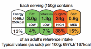
The Chilean Warning Label - South America
The Chilean scheme was introduced through the 2016 Chilean Food Labelling and Advertising Law which included a requirement that all foods and beverages that are high in calories, sugar, sodium or saturated fat must be labelled with a warning symbol. The limits that trigger the warning label, which resembles a stop sign and has the wording ‘high in’ (alto en) displayed, has been reduced over time. Products that display the label are also subject to advertising and marketing restrictions, but we did not consider this aspect in our research.

The Nutri-score scheme - Europe
The Nutri-score scheme originated in France in 2017 and is now used in several European countries (including Belgium, Switzerland, Germany, Spain, the Netherlands and Luxembourg). It is based on a five colour nutritional scale from dark green to dark orange, along with the letter A to E. The scheme applies to food products that are required to have a mandatory nutrition declaration on the back of pack. This excludes unprocessed products that are comprised of a single ingredient or categories of ingredient (e.g. fresh fruit and vegetables, cut raw meat, for example) as is also the case for the multiple traffic light scheme.
The scale is attributed according to the calculation of a single and overall score that takes into account the following for every 100 gram or 100 ml of the food product:
- the amount of nutrients and foods that should be encouraged (fibre, protein, fruits, vegetables, pulses);
- the amount of nutrients that should be limited (energy, saturated fat, sugars, salt and non-nutritive sweeteners).

Examples of how the current Multiple Traffic Light scheme is displayed

Five food categories and rationale
We chose food categories where nutrition labelling is most visible and where people most often make quick, discretionary choices. These products account for a significant share of everyday purchases and are central to discussions about sugar, fat, and salt reduction in the UK diet. Although not our primary focus, we also ensured that products were included that could also be on offer in out-of-home settings.
Selected food categories
- Snacks (crisps, chocolate, biscuits etc.)
- Often impulse purchase where labelling may be overlooked
- Typical high in fat, sugar, and salt
- Useful for comparing labelling effectiveness within a category and across products (including out-of-home)
- Breakfast cereals
- Perceived as ‘healthy’ but can be high in sugar
- Commonly purchased by parents for children
- Helps capture family purchasing decisions and the impact of front-of-pack labelling
- Dairy product
- Allows assessment of the importance of nutrient breakdowns
- Includes products high in saturated fat, salt, or calories, as well as those with positive nutritional contributions
- Condiments
- Useful for understanding how consumers interpret information per portion
- Helps evaluate the relative dietary contribution of small-quantity items
- Ready meals (e.g pizza, lasagne etc.)
- Often high in salt, sugar, and saturated fat
- Convenience-focused products where quick decisions are made
- Labels are important in helping consumers identify ‘healthier’ options
Examples of tomato ketchup condiment stimuli

Examples of ready meals stimuli

Methodological Artificial Intelligence (AI) Innovation
This study used an innovative digital approach to observe people’s real-world behaviour across a broader range of participants and contexts than is typical for qualitative research. By combining open-ended responses with in-the-moment observation, it captured more authentic, everyday behaviours while also providing robust qualitative evidence.
| Feature | Design Innovation | Impact on robustness, validity, and reliability |
Sampling at scale | Using a mobile app alongside real-world observation allowed us to gather richer, in-context insights and collect data at a scale that would not be possible through standard qualitative approaches. | Allowed collection of a large, real-world sample (460 participants at-home and 52 supermarket shoppers) supporting the calculation of quantitative metrics alongside rich qualitative verbatims. |
Analysing at scale | The AI tool performed a thematic analysis of open-ended responses collected from participants. All data from the AI was quality assured by researchers. | The AI tool identified and grouped key themes from hundreds of open end text data. It generated a unique set of categories based purely on the content provided by participants, rather than using a pre-determined or fixed coding framework. It then assigned percentages to these emergent themes, reflecting the proportion of responses that belonged to each category. |
Bias mitigation and enhanced qualitative insight | During live fieldwork, the AI engine embedded within the app monitored participant narrations for specific keywords (e.g. “red”, “sugar”, “traffic lights”) and delivered automatic, in-the-moment prompts. This not only helped reduce bias but also encouraged participants to provide deeper qualitative insights by exploring their reasoning in real time. | By deploying automated, immediate probes only when the topic arose spontaneously, the tool ensured that responses reflected genuine, unprompted engagement with labelling cues, rather than expected or socially desirable answers. |